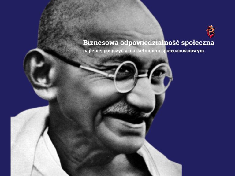
In the world of visual marketing, a logo is not just a graphic symbol of a company. It is a story, the essence of values and passion, enchanted in form and color.
My logo, although simple at first glance, hides deep symbolism and mathematical perfection. I invite you on a journey through its nooks and crannies, where love, blues, courage and Fibonacci’s golden division meet as a reflection of closeness to nature and the universe.
The golden division: a pattern of existence
Already the ancient Greeks discovered that the golden ratio – a mathematical proportion that appears in nature, art and architecture – is the key to harmony and aesthetics. In my logo, this ideal proportion is no accident. The use of the Fibonacci sequence, which defines the golden ratio, makes the logo not only beautiful, but also naturally eye-catching. It’s more than design – it’s a manifestation of the order of the universe, enchanted in the symbol of my brand.
B for Brandt….😎
The centerpiece of the logo is the letter “B,” which flows seamlessly into the shape of a heart. This is not only the initial of my name, but also a symbol of the values I hold:
- B – Be – be! Live!
- Brave (Courage): In business, as in life, courage is crucial. It’s what allows you to break barriers, take risks and realize visions.
- Blues: My passion for the blues is a metaphor for life – full of emotions, experiences and freedom. It is the music of the soul that inspires me to think and act creatively.
- Brand: The logo is inextricably linked to my brand. It represents my identity, values and the promise I make to my customers. My name is Brandt… 😎 B-)
Hat: elegance and style in detail
The hat, adorning the letter “B”, is a symbol of elegance and class. It’s a reference to my fascination with style, but also to tradition and timeless values. In business, as in fashion, details matter. The hat in my logo is a subtle reminder to take care of every element of the brand image.
Red: the color of love and emotions
Red, the dominant color in the logo, is the color of love, passion and energy. It is a symbol of the emotions that drive me to action. Red is “hot”, premium – it’s a color that attracts attention and is memorable. It’s a bold choice that reflects my determination and confidence.
Love: the essence of everything
The heart, hidden in the letter “B”, is primarily a symbol of love. I believe that love is the most important value in life and business. It is what brings people together, builds relationships and creates positive energy. In my logo, love is the foundation on which everything else is based.
Summary: A logo with a soul
My logo is not just a graphic mark. It’s a story about my passions, values and beliefs. It’s a symbol that combines the mathematical precision of the golden ratio with the emotional depth of love, blues and courage. I hope this story inspires you to think about your own logo and the importance of making it a reflection of your identity.